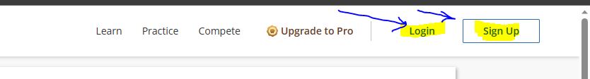
I request your attention to look on the navigation section of your account profile and home profile.
It gets hard to navigate back from account profile , right now it is showing two option student and faculty.

would request you to make UI{user interface} same as back, otherwise it will effect user experience .
As,